Visualization pane
Metrics are represented in your dashboard using visualizations. A visualization can be a single value or a complex chart or graph.

Use the Field picker and Data pane to set up your query.
In the Visualization tab, click the icon for the type of visualization that best communicates your data. The most common formats are shows on the toolbar. The format of the metric you’re basing your custom query on is selected by default. For a complete list of available visualizations and corresponding options, see the Looker documentation ↗️.
Table
Columns
Bar chart
Scatterplot
Line graph
Area
Pie chart
Google maps
Single value
Click
for additional, more complex visualization options.
Click Edit to configure the visualization option settings (e.g., naming, arrangement of chart axes, chart color palette, etc). Available options available depend on the type of visualization you’ve selected.
Peacock Ad Manager also supports forecasting, which uses the data results in an Explore's data table to calculate future data points. You can learn more about forecasting in the ↗️ Looker documentation.
Include multiple visualization types on a single chart
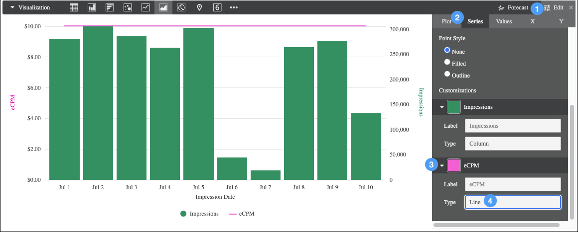
Charts can include multiple types of visualizations. For example, you can create a chart that uses both lines and columns.

To create a chart that includes more than one visualization type, create an initial visualization and then perform the following steps:
Click Edit to show the customization options.
Click the Series tab.
In the Customizations section, an entry appears for each series in the chart. Select the arrow next to the series to display its customization options.
In the Type box, select the type of visualization to use for that series.
Line and scatter series are always layered in front of area, column, and bar series.
To alter the layering order of column, bar, and area series, change the series' positions in the Data pane and click Run. The leftmost series layers on top and the rightmost series layers on bottom.
Create stacked charts with multiple visualization types
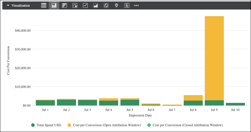
You can include stacked series in a chart with multiple visualization types. All series of the same type as the chart type that you selected in the Visualization tab stack together; series of other types won't stack. For example, in a column chart, column series will stack, but line series won't stack.

To create a stacked chart, perform the following steps:
Create and run a query with multiple series. This can be done with multiple measures or with a pivot.
From the Visualization tab, select one of the following chart types:
Column
Bar
Scatterplot
Line
Area
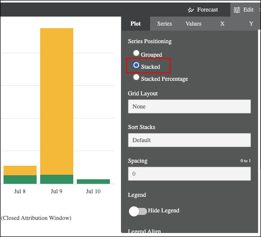
Click the Edit menu.
In the Plot tab, under Series Positioning, select Stacked. This option stacks all series as that chart type.

In the Series tab, under Customizations, expand the series for which you want to change the chart type.
For each series that you want to change, select one of the available options in the Type field. You can select different chart types for each series.
By default, all series are added to the left axis. If you want to use different y-axes for the stacked series and the other series, open the Y tab, and drag the series that you want to change from the Right Axes sections to the Left Axes section. Alternatively, you can use multiple y-axes or x-axes.
Hide fields from visualizations
All dimensions and measures returned by a query are added to the visualization. However, sometimes, you may not want to display every dimension or measure in the chart. There are several methods to hide fields:
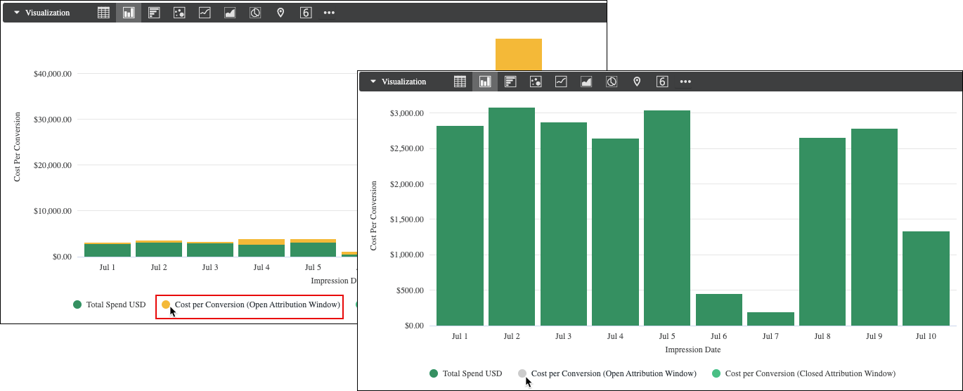
Temporarily disable a field while viewing a visualization. To do so, click the field in the legend. The name of the series that you select is grayed out in the legend, and the visualization is updated to exclude the data from the visualization. To show the field again, click the field in the legend again.

Completely hide a field from the visualization. To hide a field, click
on the column.

