Add a button to a dashboard
ADVANCED TOOLS
To add a button to your dashboard, perform the following steps:
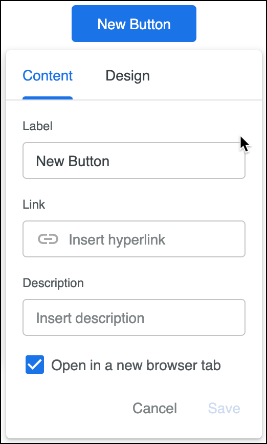
Click Add > Button. A new button appears at the top of the dashboard with the editing dialog open.

In the Content tab, complete the following fields:
Label This text appears on the button. The button expands its width to accommodate the label until the label reaches the width of its tile box. Once the label reaches that limit it’s truncated. If the label is truncated, it can be repeated in the Description field.
Link This is the URL that the button takes viewers to.
Description The description appears when you hover over the button. If you don't enter a value, the description defaults to the link URL.
Open in a new browser tab checkbox Enabled by default. When checked, the link opens in a new browser tab rather than navigating away from the dashboard.
In the Design tab, customize the appearance of the button:
Button Style Select one option:
Filled Button has a colored background and white text.
Outlined Button has an outline and colored text.
Transparent Button has no outline or background. It has only colored text.
Color Select one of the provided themes on the Themes tab or customize a color in the Custom tab.
Button Size Choose Small, Medium, or Large to set the size of the button text. The height of the button adjusts to fit the text. The default size is medium.
Alignment Choose Left, Center, or Right to horizontally align the button within its tile box. The button's tile box defaults to full width, and the alignment defaults to center.
Click Save.
By default, a new button is placed at the top of a dashboard within a tile box that is set to the full width of the dashboard.
